
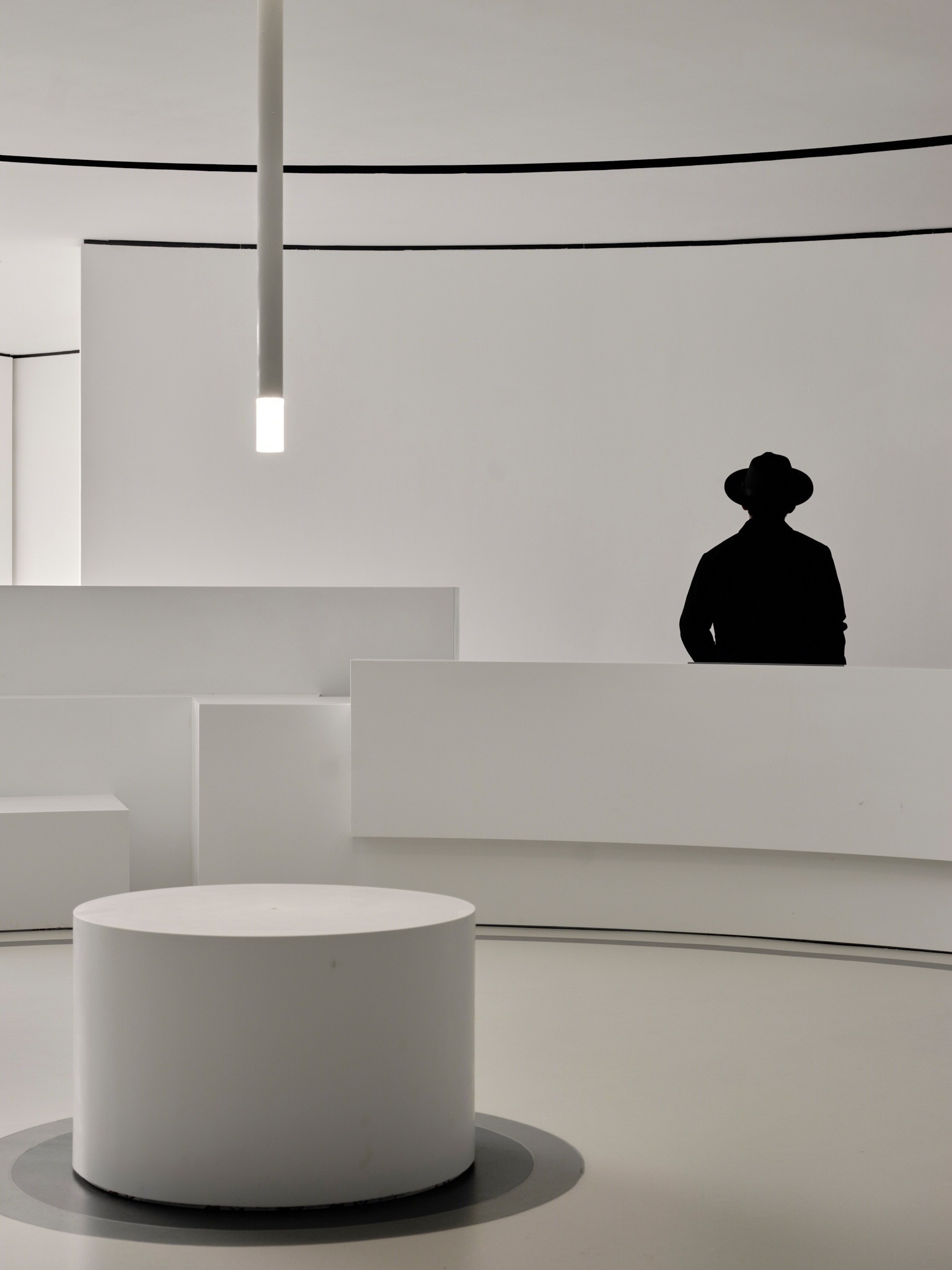
Shanhe Pharmaceutical’s new office redefines the relationship between geometry, clarity, and human experience. The design concept draws from the company’s dedication to scientific precision and holistic wellness—translating these values into a spatial language of curved gestures, modular divisions, and atmospheric contrasts. The result is an environment where function is seamlessly woven into form, and innovation is made tangible through spatial choreography.
Shanhe Pharma
Workplace
Changsha, Hunan
February 2024
At the heart of the design is a celebration of circularity and flow—both literal and symbolic. Circles are integrated into the planning strategy, ceiling language, and key furniture pieces, creating a sense of movement, unity, and rhythm. The office becomes more than a workplace; it becomes an ecosystem of interrelated zones, where research, collaboration, and contemplation occur without visual interruption or architectural hierarchy.
The existing space was a rigid rectangular floorplate, segmented by orthogonal partitions and limited natural light. The transformation began by softening the geometry—introducing curved walls and ceiling arcs to replace harsh corners and linear divisions. By breaking up visual symmetry and introducing concentric forms, the design encouraged organic flow and spatial layering. The resulting plan is both intuitive and fluid, guiding users from entry to work zones, meeting areas, and informal lounges through spatial cues rather than fixed walls.
Geometric motifs such as arcs, rings, and ellipses are not just visual signatures—they’re organizational tools, defining zones without physical barriers. Instead of separating functions with walls, we used overlapping circular footprints to suggest use and transition, creating spatial harmony that echoes the company’s integrative approach to health and science.
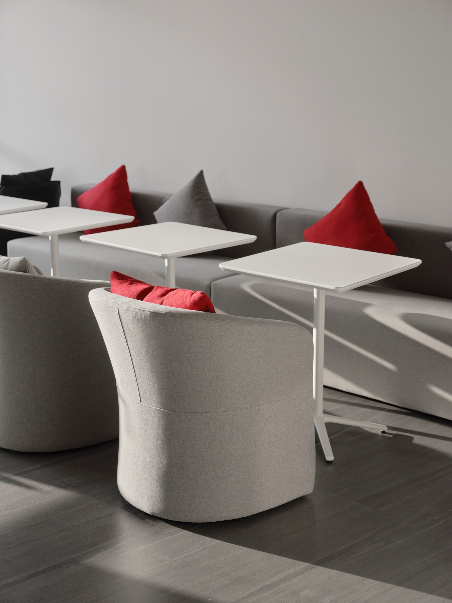
Ceiling design plays a sculptural role, with a continuous curved soffit detail weaving across work zones like a rib – bon—subtly embedded with lighting and acoustics. Furni – ture selections reinforce the circular theme, from rounded meeting pods to soft modular benches. Minimalist joinery and flush detailing echo pharmaceutical cleanliness while supporting spatial calm. The overall feel is both sophisticat – ed and human, merging clarity with character
Have a question? Check our FAQs below or contact us directly.
Let’s discuss how we can help with your next project — from design and delivery to custom materials and cross-border supply.